Mapping the GIS Adventure: Maps and Napkins – St. Louis

I recently was tuned into a company in the UK that creates “Mapkins” via a post through the GIS Lounge, and was intrigued. However, for a price tag of $60.00 per four napkin set, the likelihood I would be getting these city customizable napkins was highly unlikely. Also, each set gets one city, whereas I had four cities all picked out in my head. No thank you.

My husband commented that with our artist relatives and friends and my GIS skills, I could probably just make the designs myself and then get them screen-printed for less of a cost (or at least, to exactly my liking). Inspired, I went ahead and started with St. Louis, which is a city I recently visited and quickly loved, and because it’s one of the cities I’ve visited and liked in one of the two states I’ve ever lived in – along with being one of the cities in my list of four whose GIS data I haven’t played around with yet. So, I simply googled “St. Louis GIS data” and off I went.

It should be pointed out that St. Louis actually straddles the Illinois-Missouri state line, and the portion belonging to Illinois is actually referred to as “East St. Louis” and is considered a city separate from St. Louis, MO. I discovered this soon enough because while St. Louis, MO has their GIS stuff together, East St. Louis does not (sorry, East St. Louis – if there’s some secret website I don’t know about, I would love to make a correction). Easily enough, I found the city boundary and street line data for St. Louis, but could not for the life of me find anything for East St. Louis. I finally turned to TIGER data from the Census, and was able to download block level data for the entire state – which is certainly going to be useful for me to have some day, I suppose, but not right now. I was able to select from there the blocks from St. Clair county, where East St. Louis resides. But at that level, I was at a loss of how to select just the East St. Louis bound blocks.

At this point, exasperated, I told my husband we could do without East St. Louis – I really had only visited St. Louis anyway. He looked at me, and said, “I’m sure you can figure it out, you’re a GIS whiz.” Well. With a challenge like that, it was time to rise. I knew I had the tract numbers for the blocks, so if I could just go up a level and see which tracts belonged to East St. Louis, I could select the blocks through that information and bam, East St. Louis. The problem was that information was not particularly available. And here comes the part where someone, one day, will read this and know the easier way to do what I was trying to do and rolls their eyes. To them I say, discovery should not come that easily! Or at least, not while I’m trying to protect my ego.

First, I looked up the East St. Louis boundaries on Google Maps, so I could know what I was looking for exactly.

estlboundariesgoogle
Google’s idea of where East St. Louis begins and ends, and my reference map.

I then went to American FactFinder and used their “Select Geographies” tool to figure out how to select for East St. Louis. After experimenting with several methods (including their draw a polygon tool – nifty!), I was able to select “East St. Louis” – but this did not yield what I was looking for because tract and block numbers did not appear to be listed within this small geography. But if you do attempt to map St. Clair County tract information (such as AGE BY SEX) through FactFinder’s map tool, you can see which tracts are in East St. Louis. Or, you can ultimately just map the Census tracts through ArcMap and now that you’ve intimately memorized

amfactfinderestl
The various Census tracts of St. Clair county around the East St. Louis area.

the shape of East St. Louis according to Google, info-click each tract following the outline and record which tracts are within the boundary. Then, I selected each tract number within my block layer, and voila! East St. Louis.

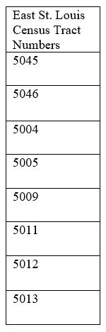
Now, I am not a cold-hearted person. I may have just outlined the difficult way to do it, but for your convenience, I have listed the tract numbers I used to select East St. Louis blocks in the table below. Though again, discovery perhaps should not come so easily – but that’s for you to decide.

ctnumbersAlso, please see the rough draft of my potential napkin map below as well. My husband isn’t a fan of color on these potential future napkins, so I’ve gone for spidery black lines for the streets. There will probably also be a scale bar of a different caliber, and a few other stylistic details, but this is the basic idea. I’m already in love. Thanks for reading, and if you have any easier ways to obtain my hard-won information (such as some handy Census resource with a list of each town’s Census tract numbers), please share! I love learning the easy way.estl

 UPDATE: One of my good friends read this post and recalled that the Census has to list the tracts in each county, so she searched for such a list and came up with the map below. Link is here:

I told you someone would get me the easy way! From the U.S. Census
Zoomed in.

Geography & GIS Reader: Articles Worth Reading -December 2016

Happy December! The month of my birthday, I am for the first time experiencing snow. While my feelings on that fluctuate, I am happy to share with you some great pieces I’ve gotten to read in the past month on GIS, geography, and those in between.

On Cartography: 

How The Gorgeous Language Of Maps Helps Us Understand The Worldby Kate Abbey-Lambertz

Any lover of maps and the internet had seen their fair share of poorly drawn maps. Not only do they proliferate on the internet, but in our classrooms and our conferences. Some may be technically incorrect (re: not projected) and some may just use the default ArcMap font settings and basic layout. It’s understandable for the beginner GIS learner. However, when you’ve been making maps for two years and you’re still not taking some creative liberty, I wonder whether you’re lazy, or scared. But not the folks at the Harvard Graduate School of Design! They’ve essentially compiled a list of best hits of maps in regards to cartography. An absolute treasure to view, and I’m betting even more intriguing in book form.

On Healthcare:

Life in Obamacare’s Deadzoneby Inara Verzemnieks

While not overtly an article on geography, it’s a theme woven inherently into the topic. Where people live and work affect their access to healthcare, and it’s important to note how even a healthcare system meant to get everyone misses a few because of geography. As a health geographer planning on living and working in the US, I found this article extremely relevant and anyone with an interest in geography or our healthcare system will too.

On Housing:

Newly Released Maps Show How Housing Discrimination Happenedby Greg Miller

Ah, redlining. In case you don’t know about this racist tactic used by real estate agencies to keep residential areas segregated, you can check out this article on the series of maps where the term came from. One of my favorite things about maps is that things like discrimination can come out all too clearly when mapped. Learn a bit more about the history of your residential area and receive a graver understanding of the power of maps – and why we should use them for good. 

On Geography: 

Science on a Sphere: Earthquakes 2001 – 2015by the National Oceanic and Atmospheric Administration

So these two geography links are less articles, more animated fun. This link will take you to a fascinating world earthquakes animation and other detailed information – hopefully my physical geography friends out there enjoy this even more than I did – it’s pretty darn cool!

What is Geography?by Mary Crooks

While also not an article, it is a handy explanation of geography to keep on hand. As GIS makes its way into other fields and physical geographers search again for what it is they truly do (see: critical physical geography), it’s always nice when someone puts together succinctly and colorfully what geography is. Remember folks – it’s a spatial kind of thing.

That’s it for this month! I tried to get something in here for everyone, but if you ever have any suggestions, please comment or email them to me – I am happy to hear them, or even if you’re just a fellow geographer wanting to say hello, please do!

On Cartography: Maps Can Lie – Here’s How We Avoid That

Regardless on where you stand with the DAPL situation (I’m anti-DAPL but that’s a different conversation), pipelines and their safety are on people’s minds. There are certainly many ways to analyze these safety concerns, and one great way is through maps. However, like any other news source, maps can lie, and when they lie, people can misunderstand the situation and be misled. As a lover of cartography and the benefits it offers the world, seeing a map that is poorly constructed and potentially lying widely shared sets me on fire. Maps are so incredibly useful, and I love when people turn to maps to understand their world a bit better, but if those maps can’t hold up to critical analysis, they cause people to lose trust in the medium, but also wonder if maps are a worthy pursuit at all.

I recently dealt with this situation with this map on the dangers of pipelines in the U.S. It’s a video lapse that displays all pipeline-related deaths, injuries, oil spills, and a category referred to merely as “Natural gas” in the U.S. since 1986 to present day. There are many, many issues with it, and while I would love to point them out in detail, I want to point to it as an example of what a person unfamiliar with map basics should look for to ensure they’re reading a map worthy of their time:

1. Is it projected?

I’ll admit – unprojected maps are one of my biggest pet peeves in the whole wide world of mapping. This points to my background as a student who took a course in the principles of GIS, but the fact is, when a map is unprojected, there’s a good chance its wrong. Not all maps need to be projected of course, but standalone maps such as the one above does. The U.S. is an easy map to see if it’s projected or not – the states first off look weird, but most U.S. map projections curve the U.S., which is most noticeable in the North, where when unprojected, Washington, Idaho, Montana, North Dakota, and Minnesota all appear to have incredibly straight edges. A map projection is an attempt by the cartographer to display an area as closely to the way it would look on the globe. It is an attempt in accuracy of where things are. When a map is unprojected, nothing on it is as close to where it should be as where it would be when projected. Here’s an example of what a projected U.S. map should look like versus an unprojected map:

ch2_usanoproj
An unprojected map from http://mama.indstate.edu/users/geboen/ch2_f99.html
threepro
An example of several projected maps, by Peter H. Dana of University of Colorado-Boulder

2. Is the data source clearly available?

Sources, sources, sources! The good news about GIS information is that it’s harder (or at least not as worth it) to come up with fake map information, but the issue is that maps lie, and a lot of that comes from the way the cartographer chooses to display the information. Data can be manipulated in so many different ways, which is why its always good to see an attribution to the data sources on the map – you can confirm that the data comes from a reputable source, which is thankfully the case with this map, as it comes from the U.S. Department of Transportation.

3. Is the legend telling you everything about what’s going on with the map?

In the case of this map, there isn’t a ton of clarity – one of the symbols is defined as “Hazardous liquids (mostly oil)” which doesn’t actually tell you when those liquids are. What do they mean by “mostly”? How do they measure what is “mostly”? By half? By 80%? It would make more sense for the sake of clarity to have a list of what those liquids can be, or at least what percentage of the liquids are oil. Also, note that it also says the points for that category are scaled by spill size, but do not show you what the scale is or what they mean by size – is it measured in the amount of liquid spilled or the area covered?

The point is, your legend is supposed to clarify what appears on the map. It should be simple and straightforward, and answer any basic questions you may have about the information on the map. That’s not quite what happens here.

4. Can you tell who commissioned the map? 

Cartographers are often asked to make maps for people, businesses, and other entities. When this happens, it’s important to make it clear who asked for the map so that way any interests can be made known to the reader. It’s fine for an environmental group to request a map, but it is always worth knowing that they’re the ones who requested it so the reader can see for themselves why a cartographer might have left out or emphasized something on a map.

Those are the basics! I also think it’s important for a map to be visually appealing, but that’s just me and my cartographic eye. If you have any opinions or questions about evaluating maps for validity, please comment below!

Geography and GIS Reader: Articles Worth Reading

When it comes to feeling comfortable on a topic, I feel most comfortable with starting out my understanding of the subject with a Google search. I tend to read a lot of articles throughout the day, and while not all of them relate to GIS and Geography, many of them do and I thought it might be worth sharing in a dedicated post once a month. Just a fun roundup of 5 – 10 articles I’ve seen in the month (or in the past) with brief summaries, and obviously, links. To start us off, I’ve pulled a few articles from my Pocket archives (by the way, a great tool to “store” any articles you love reading and categorize them for easy pull up later), and tacked on a few summaries. Hope you enjoy!

On Cartography:

“Louisiana Loses Its Boot” by Brett Anderson

This was published in September 2014, but it’s as relevant as ever. A long read, but full of detailed, rich descriptions of Louisiana and an understanding of how maps, paper or otherwise, shape our understandings of a region. Read here.

On Women in Geography:

“The Forgotten History of Female Mapmakers” by Laura Bliss

Did you know that women once used to sew embroidered globes, with diameters no bigger than a few inches? Yeah, me either. Also, they were meant to be utilized – and so we learn in this article on how women were actually major contributors to cartography for years, despite never being remembered for it. Sure, the article doesn’t mention Marie Tharp, but perhaps that’s because being the first person to map the ocean floor could be considered it’s own category of major contribution. Anyway. Check out this article here.

On Software:

“QGIS Features I Long for While Using ArcGIS” by Alexandre Neto

While I personally am a fan of doing as little cartography work in ArcMap and switching over to Illustrator, I find that there are some excellent points here on QGIS  versus ArcMap. Regardless of your preferences, knowing more than one platform is key, and if you’re a user of QGIS, you might be excited to know this information. Check it out here.

On Economic Geography:

“The $5 Cereal That Provoked a London Mob” by Heather Horn

While this isn’t outwardly specified as “economic geography,” there are key elements in here that harken back to economic geography. They even quote an economic geographer, so really I’m not certain you can deny it’s geography. While not about geography itself necessarily, I include it because I feel part of the current issue in geography is the lack of understanding folks have of it. They don’t see the name applied in articles where it actually would be exactly geography. We’ll see articles get tagged as “tech” or “medicine” or “education” but nobody sees “geography” when it would be an excellent description. I would like to share more articles that I feel would be tagged geography, if only the journalists would do it.

I’ll admit this was a cartography-focused post this time around, but I promise I’ll get some nitty-gritty GIS/Geography articles next time. Happy reading!


Mapping the GIS Adventure: I Need a Doctor, but I’m Brown in Chicago

What really convinced me to stay in my new cartography course despite having already taken a cartography course was not only that I would be expected to utilize Illustrator, but also that I would be encouraged to make maps that relate to my work. As a graduate student, I am planning on studying Latinx, specifically women in Chicago and possibly San Antonio, and their access to healthcare and how their ethnicity and race affect it. For this specific map assignment, we were expected to create a grayscale choropleth map with an inset, of any area and it needed to help us with our work, and hopefully would be “interesting.” In this case, I thought it might be interesting to check out what the City of Chicago had by way of healthcare facilities and population data. Sure enough, the City of Chicago has plenty of data and fairly well organized. Although, they don’t seem to get back to FOIA requests very quickly…or at all (more on that later).

At first, I had planned to use block data for this map, but there were so many blocks the map was virtually unreadable at a large scale in choropleth form. So, I chose census tracts instead and off I went. I then chose to add all of their current hospitals and clinics according to the City of Chicago. And as you can see, Latinx are clustered in specific areas of Chicago – areas that are wanting in large numbers of healthcare facilities. I was really happy with this map, because it was the first clear picture I had on the area and demographic I was interested in studying. Plus, dealing with the Chicago data was a delight, and reminding myself how to use Census data was of course a great exercise.

With this map, I thought it was important to differentiate between the types of healthcare facilities, which I tried to do using stars, squares, circles, and triangles, though at this scale, it was a bit difficult when they were clustered together. The font I used was Berlin Sans FB, which I really enjoyed as part of the tone of the map. In the original that I turned in for class, I received feedback from my classmates that the font choice was strange for the legend – which was because at the time, it was bolded, so I changed that and I agree that it’s much easier to read. I was also missing a North arrow, which I fixed here. Other comments from my reviewers included a disagreement on using equal interval to display my data which I question, considering we’re dealing with whole people here, and equal interval allows an equal distribution among census tracts – allowing for what I believe, would be the most fair display of where Latinx people are in Chicago. One other reviewer offered the suggestion of using ratio data, and I do believe that percentages might have been slightly clearer to the map reader, but I think it still makes a point.

I added the Expressway because my professor thought a major road would help people anchor themselves locationally around Chicago. This was a bit difficult to do because the road lines are in pieces in shapefiles and I had string them together as a selection. I also am not familiar with Chicago, or its major roads – one friend suggested I add the “loop” which is something to look into. But the rest of the pieces on this map were pretty straightforward. It was this map that made me realize I enjoy having insets on my maps. They help balance the map.

Some Illustrator points:

  • The symbols for healthcare facilities have two lines, which is hard to see on the map but in the legend it goes, white fill, gray inner stroke and then black outer stroke. I created this by going into the Appearance tab and added a stroke, bumped up the thickness, and changed the line color.
  • I then used the Graphic Styles tab to add this as a Graphic Style (I do this for most things) and then selected each symbol and then selected the Graphic Style to change it. I love the Graphic Styles tool.
  • I don’t exactly know what I did to the dashed line to make it hide behind parts of Chicago, but I know that it’s not because it’s behind it in the layers, especially with the scrunched up areas later. I’ll play with that.

What are your thoughts?

Oh, and as for my FOIA comment – I originally was having a hard time getting the block data (before I realized I didn’t want to use it) from the City of Chicago’s website when it should have been available according to the website. So I called the Information people who sent me to a GIS guy for the City of Chicago, and he told me that I would have to submit a FOIA request and he would be able to send it over within the week. I did so, and as of 10/26/2016, still have not received the data. Luckily, I know how to use the American FactFinder (Do you?)

chicagolat_10_5_16-01

Mapping the GIS Adventure: Finally, Illustrator – I’ve Entered Fantasy Land

So, my time in undergraduate consisted of two GIS classes and a thematic cartography class. I consider only my final project map from the thematic cartography course as worthy of showing to the internet, so I will post that later on. However, currently in my first semester of coursework in my graduate program, I chose to take another course on cartography, particularly because the course is focused specifically on teaching us Illustrator, which I have only learned how to use on my own time. What I’ve also enjoyed is that the maps are only assigned by “type” but I decide the data to use, which has been really fun and helpful.

But first, we were assigned the topic of “fantasy” and provided with fake data, on the two countries of Hopescape and Amberville. These were the basic requirements for the map:

  1. Use color
  2. Have a fantastical feel to it
  3. Use three different point symbols, three different line symbols, and three different area symbols
  4. Fit the standards set out by National Geographic
  5. Be a full page

So, I’ll admit right off, I believe I have a much less fantastical feel to my map than most fantasy maps, and that’s because I just couldn’t bring myself to use a font that was Serif and over the top. Ah well. But I definitely loved using color in this case, especially since I was armed with the wonderful colorbrewer.com – I highly recommend it whenever working on map color. This was especially important, given all the color I had going on. As for the three different symbols for points, lines, and areas, a table:

Area 1: Biomes
Area 2: Lakes
Area 3: Background Countries
Point 1: Country Capitals
Point 2: State Capitals
Point 3: Border Checkpoint
Line 1: Political borders between states and countries
Line 2: Rivers
Line 3: Roads

I had a lot of fun with the rivers particularly, primarily because I was using the pencil tool and dragging it around in Illustrator really made for interesting results. For example, the double river in the top right corner? Pure accident. But I kept it, because it looked pretty cool. There are other elements of this map that I had to hand-draw, such as the mountains and sand dunes, and of course, the “Amber Waves.” My professor is actively trying to get us to work in Illustrator and in this case, added incentive by expecting us to add “fantastical” details to the landscape. Hence, things like the “Pit of Despair”, my “Dusty Hope Dunes” and other things. I wanted to add some kind of creature to the pit but I honestly don’t quite yet have the Illustrator chops. The fun of this map was not really caring about accuracy, as in, if I wanted a lake to exist, but I didn’t want to have to worry about it’s name fitting inside of it, all I had to do was expand the lake. This map was just what I made of it, and I tried to really enjoy the artistic side of cartography that such a freedom warranted me.

As for skills I learned/honed on this map, they were primarily in Illustrator – I learned how to create the drop shadow (shout out to geographer Rachel Passer at “GIS & Mapping Tidbits” who helped me figure that out). I also learned how to create a dashed line, the true value of organizing your elements through Illustrator’s own “Layers” catalog, the proper use of their pen and pencil tools, and how to create a gradient. The best part is that while these are pretty basic, the fact that I learned them gives me hope, and should give anyone else hope – it isn’t that hard. I’ve assembled some basic reasons and suggestions to help you see the value of learning the aforementioned skills too (unless of course, you already have).

  • Drop shadow – it’s great because it looks cool, and it draws the eye to the focus of your map. As for completing the task, I followed the tip of a classmate – “select the layer/object you want, go to the “effects” menu at the top, go to “stylize”, and then choose drop shadow” but still had problems with getting the drop shadow to go around the entire polygon, which Rachel noted was because I wasn’t using a polygon that had a fill, just an outline. Change that, and your problems will likely disappear!
  • Dashed lines are fairly easy, but add such detail to your map. Draw your line, check out the “Stroke” tab, check that Dashed Line tab and mess around with the dash and gap spaces to created the desired effect.
  • As noted by a helpful Illustrator tutorial I took, the pen tool is great for straight lines, the pencil for not so straight lines. Mix and match as necessary.
  • Okay, it’s not that I didn’t know how to create a gradient, it’s that I didn’t know how to add colors to it. Using the most updated Illustrator gradient tool, double-click your sliders on the Illustrator tool and select your colors for either end. Have fun!

As for the final map:

fantasymap_designclass

Let me know what you think!

Mapping the GIS Adventure – A Note

Well, it’s been a very long time since I last wrote a post, and that’s partially due to the general difficulty I have with keeping up with things through my own personal accountability, and partially due to the fact that my senior year of undergrad was busy and difficult. However, I have graduated and am now in…graduate school, with the definite chance that I’ll be even busier. But I am also determined to keep up with this blog, with the conservative goal of a post once a month.

I also feel it’s important to note that some things have changed since my last post. The labs I was displaying in the past were from my very first interactions with GIS and cartography. While I certainly appreciate the basic skills I gained throughout that course and from those labs I struggled with, I have improved far beyond that level (if I do say so myself – I’ve taken a lot of GIS courses since). Thus, I will not be purposely continuing my posts focused on those labs. I may go back to them in the future, but I might never finish showing all the labs. And don’t worry, you really aren’t missing much 😉

The format, however, will probably remain the same. My goal remains to share the maps I make for class and in my spare time and the methods I used to make them. Sharing techniques are important and I hope to add to the blogging GIS knowledge on the internet. Hope you enjoy!

Mapping the GIS Adventure – Lab 7: Pollution is Bad, and It Might Be in Antarctica

Note: Sorry for the long hiatus. The fall semester took a lot of effort! But I’ve got tons of new maps and labs for y’all, so look out!

Lab 7 was a real turning point in the semester for me. I had made friends in my lab section, so I had back up when the technical parts got confusing, and even so, I managed to get the ArcGIS functions done correctly. The lab was turned in on time, and had received well enough marks. Also, the lab used real world data! Or as my professor puts it: “The good part about the lab is that it uses real world examples; the bad part about this lab is that it uses real world examples!”

Because yes, my wonderful professor was hoping to teach us an important detail about real world data: it’s not all it’s cracked up to be. We were working with soil sample data that my professor collects every year when he visits Antarctica (sidenote: he later left us before the semester ended to go there and would Skype with us during class). This data included the total petroleum hydrocarbons in randomly selected areas around McMurdo Station. So what technical things did I have to undertake?

  1. Create a personal geodatabase that contained only two of the feature classes that were available in the soil sample data and of course, create those two feature classes and convert them into point feature classes.
  2. Compute some selected statistics. This was just utilizing some statistics features because my professor, bless him, knows that statistics is important and we need to learn how to do statistical functions.
  3. Join data tables together. Shockingly to me now, one of the hardest parts about this lab for me to do back when. Another quote from my professor: “Sometimes success with joins just requires a bit of patience.”
  4. Then the map! It had to have color. It had to have graduated symbols. It had to show the distribution of Total Petroleum Hydrocarbons in the soil samples, overlaid on an aerial photograph of the station. They had to be broken into two categories, “random” and “intensive” and each category broken into three classes: 0-30.0 ppm, 30.1-4100.0 ppm, 4100.1-maximum TPH.

The boring part of this was that I had to make probably at least five geodatabases before I ever got near correctly making them correctly, only to realize my point feature classes were not actually converted into point feature classes, which was terrifying because none of my data was showing up in the data frame. Why did this happen? Because I didn’t completely read through my lab instructions, where my professor had purposely included bolded details on system quirks that may or may not derail us. A lot of this class was reading instructions, and a lot of my takeaway was the importance of reading instructions.

But once I figured out how to correctly join (or relate) some tables, make a geodatabase (and, ah, no, this was not with Python yet), and overlay it on the aerial photograph, it all came down to just the map. So what did I do? Well, we had three classes, and I broke up the data by those classes, and then had to have different corresponding colors with the classes and categories. With my colors, I was attempting to make a clear ascension into darker colors – now I probably would have used the same hue, with a different saturation, but ah well. I don’t think the ascension comes off cleanly here. With that, the bright pink and green for the small circles no longer works for me, because that draws more attention than say, the bigger circles. Of course, there are a ton of the small circles, but when you look at the map, the bigger circles sort of just fall away which is really disappointing because in terms of pollution, I would want to know immediately where the highest levels of pollution are.

Circles and bright colors, because what else is going to stand out against that drab Antarctica landscape?

Another issue that was pointed out to me by a fellow blogger was the lack of differentiation among the symbols. Now it’s obvious to me; different categories, different symbols, yeah? This is addressed in a later lab. Once again, my scale bar is a mess – all of those extra classes are unnecessary, and it just goes to show that I still didn’t know how to manipulate that little tool yet. I do like my map set up some. Something I would like to continue to experiment with is putting the title of my map on the map, as was done here. After taking my thematic cartography class, experimenting with text placement juxtaposed with map data seems like a fun experiment to look into. My north arrow was out of the way and discreet. I also liked all of the data information at the bottom as sort of a caption to the map.

That’s all for now, but wait until I show you the next map; I made one change, but oh how I wish there had been more. Any suggestions yourself?

Mapping the GIS Adventure – Lab 6: Y’all, That Texas Coastline is Killer

You might notice that I skipped Lab 5. This is due to the unfortunate fact that I accidentally lost my Lab 5 pdf. I still have the map, so I think I’ll be able to recreate it, but I haven’t had a chance to go digging. Since it’s been a little bit since my last post, I decided to skip ahead to Lab 6.

This lab was all about fun of digitizing, which my professor has frequently promised will be a skill I will utilize again and again. When I started the map, I was back in the midst of the crazy semester, getting swamped by all the new information and work coming my way in GIS. I was desperate to not turn in this map late, and also very, very confused.

Lab6

Digitization isn’t too hard per say, but it is time consuming. And potentially painful. I remember the night I sat down to digitize the whole map of Texas. But before that nice recollection, the details: The goal of the map was to provide a clear map of the ecoregions of Texas for state parks of Texas.  The requirements:

  • projection of the Texas data to a Texas centric projection
  • georeferencing of the Texas image
  • correct digitization of the polygons
  • assigning two attributes to each polygon construction
    • attribute 1: integer field containing the ecosystem
      number from the map
    • attribute 2: a text field with enough characters to
      hold each ecosystem name
  • An intelligible legend

So, back to the night I sat down to digitize. I had already successfully georeferenced the Texas image – or so I had thought. One of my friends kindly showed me that my amount of georeferencing points was way too high (28 as opposed to an upper limit of 20) and I hadn’t applied the suggested 2nd polynomial warp. So after georefencing again, I found myself ready to digitize. I began drawing polygons and utilizing a snapping tool, so that way I could avoid the dreaded “polygon slivers.” I can only imagine what kind of ruination would have come to me with slivers.  As I created my polygons, I realized why it was going to be torture: as I descended upon the Texas

I believe this was about an hour after I started making those polygons.

coastline, I found myself upon these craggy sections. I wanted to make sure I captured most of the detail, but also wanted to avoid having too many nodes. And as I clicked my way through that coast, I realized I was clicking my way to what also felt like carpal tunnel. Oooh, the agony. Worse, the polygons do still have some issues: along that coastline, which I did streamline a bit, you can see that the details aren’t highlighted due to coloring. This doesn’t worry me as much, because of the small number of parks along that coastline and the fact that such details of the coastline were less necessary for the goal of the map.

However, I did persevere and was able to complete the digitization. So I then proceeded to color the polygons and create that intelligible legend. As to how “intelligible” that legend actually was, well. I found I was able to simply pull the polygons into the legend, but I couldn’t figure out how to remove duplicates from the legend. I have since learned that it’s all in the legend details – simply delete the duplicates. But alas, at the time I did not know this, so for every region that exists, there is the color swatch and the number of those pops up. The Texas state parks locations also are included. However, I do wonder if my data had the names of the Texas state parks. If I did, that probably would have been a good addition to the map because I feel like while the state parks probably would have known where they are, thanks to the addition of the county lines. At the same time, there are a lot of state parks on that map and it would have just really added to the overall clarity of the map.  I also could have done well to provide more information about where my data came from. Because don’t we know that I did not make that stuff myself. I also didn’t mention my coordinate system or datum, which does no good.

In general, this is around the time that the labs starting becoming more about the technical aspects behind it. The results were of course extremely important, but the little things done behind the visual started to become very important. We went from simple technical aspects to understanding that while you could hypothetically fake a pretty map on the surface, if you started to leave out all that nitty gritty technical stuff, your map is fairly worthless. Of course, I didn’t figure this out until several maps later.

Mapping the GIS Adventure – Lab 4: Maps Are Where “Y’all” and “Eh?” Can Be Said in the Same Breath

NunavutLab4

I remember this mapping assignment with strong feelings. This was our fourth assignment, and we were into our fifth week of the semester, and I was struggling a little when it came to these maps. I was also feeling inadequate, as I had not yet made friends in the class and was perceiving everyone around me to be plugging along just fine. Of course, actually, everyone was learning this new skill as I was, and we all probably would have benefited if we had started talking to each other a lot sooner. So the map that gave me such terror was actually pretty simple: provide a size comparison between the state of Texas and the Canadian province, Nunavut. Along with this, the skill we were to learn was that of projection, both on-the-fly and permanent.

If there's any question, I reprojected all of these themes into the Canada Lambert Conformal Conic coordinate system.
If there’s any question, I reprojected all of these themes into the Canada Lambert Conformal Conic coordinate system.

The requirements for this map were similar as those of the previous labs, but also required us to get a dose of ArcCatalog and create a table that listed all of the data that we were using for the Canada map, and their original projections, and then the projections we reprojected them to, which needed to be a conformal projection. These were to be permanent reprojections, while the Texas map didn’t require permanent reprojections, but instead on-the-fly projections.  Presently, this doesn’t seem hard at all. At the time, wrapping my mind around it was impossible. The biggest issue was merely that I didn’t understand that on-the-fly projection could trump permanent projections. So even though I reprojected all of my themes correctly, I never changed the coordinate systems of the data frame, so I never saw a difference, until I learned what was going on later.

One big thing: this was where we were supposed to learn the difference between the  “Define Projection” and actual “Project” tools. My professor warned us all, multiple times to be very, very careful that we understood the difference between the two. While I certainly had an unfortunate experience with this map, I do thank the heavens that I understood the difference almost immediately. It would probably have been the straw that broke the camel’s back otherwise.

Otherwise, this map is one of my favorite maps I’ve created so far. I won’t lie – it’s because I find it pretty. The raster I used to show the physiography of Canada utilizes the same color spectrum as most physiography maps, but never before have I wanted to wax poetic on one. That might just be a dedication to Canada’s physical appearance, and I’m not even ashamed. In terms of other map elements, we were also required to show the railroads and major roads of Canada and it took me a while to figure out which colors worked best, but I feel pretty good about my bright purple for major roads and midnight blue for railroads. And I must shout kudos to esri’s ArcMap railroad symbology. Well done.

Otherwise, we were also supposed to clearly highlight Nunavut and clearly show Iqaluit, the capital of Nunavut. You’ll note that someone has definitely learned to use the “select” tool, as Iqaluit is the only city on there. The only one. Hurrah for me, because when I first took a stab at this map, I still had the selection skills of Lab 2. As for highlighting Nunavut, I think I don’t do so as successfully as say, Texas is highlighted in the inset. This is partially due to the fact the physiography needed to be clear, but was also really strong. So even though Nunavut has a different overall coloring, a red outline, and two large names shouting out to the viewer, the eye is not immediately drawn to it. To rectify that, I would have probably made the physiography a lot lighter with transparency, so that way Nunavut would have stood out more. I also would have done something about the outline, such as a black outline to strengthen the border of it.

The inset of the Texas map was pretty easy. Texas was red, outlined in black, and the rest of the visible states were yellow, outlined in gray. Not too hard to make that work, given physiography wasn’t necessary. The only aspect I found giving me issue was the scale, but once I adjusted the data frame for the Texas map, I was able to have them at a matching scale. Based off of the map, I hope you all agree with me that Texas, while my favorite big state, is still definitely smaller than Nunavut. If you don’t, I’ve failed because Nunavut has some 500,000+ miles on Texas. No, not EVERYTHING is bigger in Texas…

As for my technical aspects of the map, such as the legend, scale bar, and North arrow, I’m pretty satisfied with my space usage and placement, though I definitely would have done well to somehow fit that scale bar directly beneath Canada, so that way the ends lined up with the edges of Nunavut. I just did the finger test myself and they totally would have matched up and would have saved a lot of readers the irritation of keeping their fingers the same width apart as they moved them to Nunavut.

What cracks me up now is how this map turned from a pain in my rear to truly, one of my favorite maps. Under the rules of our class, I was allowed one free lab that  could be turned in late with no late penalty. As we already had one lab due a week, I sat on this lab all the way to Spring Break to work on it with no other requirements breathing down my neck. I remember redoing the assigned tutorials and changing the projections and realizing just how not hard this assignment was. I was able to have fun with it, and realize that a colored background wasn’t always the best way to go. I understood things I hadn’t gotten before. Lastly, you can bet getting that map done and turning it in was the best kind of relieving success.

Most of all, I learned the importance of doing your work when you’re assigned it, and crawling before you walk. The struggle to understand a concept may be torture, but once you learn it, you learn it. It helps set you up for the next struggle, with a lot more ease than if you hadn’t survived the prior one.